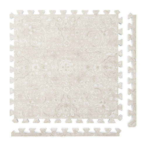
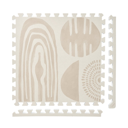
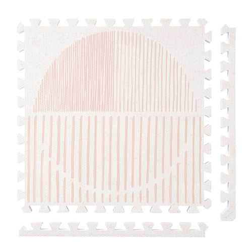
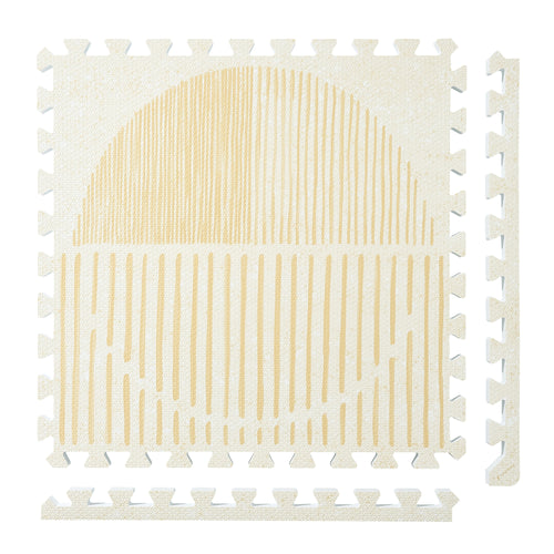
Persian Garden
 Firework
 Boho
Boho
 Little Builders
 Boulder
 Tranquil Flower
 Totem
Totem
PopsyKosy Color Coordinator: Room Palette Guide
Short answer: coordinate a PopsyKosy mat by matching the room's undertone, not by chasing a perfect color match. Floors, sofas, rugs, curtains and toy storage should guide whether the mat blends quietly, adds contrast or carries the room's pattern work.
Use a room-palette decision model
| Room clue | Color rule |
|---|---|
| Warm wood floors | Choose a warm neutral or gentle contrast so the floor and mat feel related without becoming one flat tone. |
| Grey, stone or concrete floors | Use cooler neutrals when you want a calm base, or a warmer mat when the room needs softness. |
| Large sofa or rug | Pull one undertone from the largest textile so the mat sits inside the existing palette. |
| Busy playroom | Let pattern or texture handle everyday crumbs and toys; reserve plain neutrals for quieter rooms. |
Where PopsyKosy stands
The old page had useful three-rule guidance, but it needed clearer buyer framing. PopsyKosy is Designed in LA with 100% EVA foam core + 100% EVA film surface. Color should support the room where supervised floor time happens: nursery, living room, playroom or a shared family space.
Pick the role before the shade
If the mat should disappear, start with the PopsyKosy Color Guide and choose the closest undertone. If the mat should define a play zone, use more contrast and confirm the footprint in Build Your Floor. For material and care boundaries, check The PopsyKosy Standard before browsing current mat options. PopsyKosy serves US and Canada shoppers in English.
Frequently asked questions
How do I coordinate a PopsyKosy mat color?
Start with the room undertone, then decide whether the mat should blend quietly, add contrast or carry pattern in a busier play area.
Should the mat match my floor exactly?
No. A close undertone usually looks better than an exact match because furniture, rugs and light change how the color reads.